Dashboard
Dashboard sharing
Dashboards can be either personal or shared with other users in a user group.- Personal - only you can see it
- Shared - all members of the user group can see it
It is shared if it is inside a user group's folder; otherwise it is personal.
The Dashboard menu
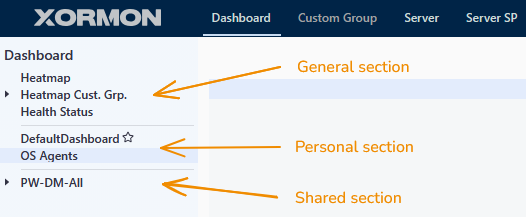
The Dashboard menu is divided into three sections, separated by lines:
- General: built-in views available to everyone: Heatmap, Heatmap Cust. Grp. and Health Status.
- Personal: your personal dashboards and folders (in the example above, DefaultDashboard and OS Agents). Only you can see them.
- Shared: one folder for each user group you are a member of (in the example above, PW-DM-All).
XorMon creates these folders automatically. If you are a member of several user groups, you will see several folders here.
|
Sharing a dashboard with your team
To share a dashboard with your colleagues, create it inside the folder of the user group you want to share it with.
Every dashboard in a user group's folder, together with all graphs pinned to it, is available to all members of that user group.
To keep a dashboard to yourself, create it in the personal section instead.
Pinning a graph to a personal or shared dashboard
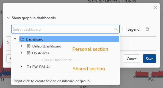
When you pin a graph, the Show graph in dashboards dialog lets you choose the target dashboard.
The dashboard list there is organized the same way as the Dashboard menu:
- Dashboards at the top, under Dashboard, are your personal dashboards.
- Dashboards below the Group Dashboards separator are shared, inside the folders of your user groups.
|
If you pin a graph to a dashboard in the Group Dashboards section, everyone in that user group will see it.
You can also create a new folder, dashboard or group directly in this dialog: right-click in the dashboard list and choose what you want to create.
What group members can do with shared dashboards
Shared dashboards belong to the whole user group, not to the person who created them.
Every member of the group has the same rights and can:
- edit a shared dashboard, for example add, rearrange or remove graphs
- delete a shared dashboard
- move a shared dashboard out of the group folder into their personal section.
This stops sharing: the dashboard disappears for all other group members and becomes the personal dashboard of the user who moved it.
Graph Builder
Graph Builder allows users to create their own graphs and place them on the dashboard.Go to Dashboard -> Manage (top right)
Switch to the Graph Builder tab and select the technology in the subtab
Enter a name for the graph, select its location on the Dashboard, HW Type, and Subsystem
Use the Item Select tool to select the items the graph should contain
You can also use a regular expression to select items.
Regular expressions ensure that the graph always contains the most current items, even if old ones are deleted and new ones are created.
Select whether you want to create a Single graph or a Graph per item.
- Single Graph
Creates a single graph that includes all selected items and metrics.
A single graph is suitable for multiple items with a single metric, or for aggregating the values of many items (sum, average).
- Graph per Item
Creates a separate graph for each item.
Graph Builder allows you to add multiple metrics with the same unit to a graph.
For each metric, you can select a display type:
- Line - unstacked lines
- Area - stacked area
- None - the metric will be plotted for each item
- Sum - the sum of values for the given metric across all items
- Avg - the average value for the given metric across all items
When the result is a single line or area, you can select a custom color for the metric.
Examples
Single graphCreate a graph for all VMs whose names begin with "NG Test [number]" and
display the CPU utilization in Hz as a line for each VM.

|

|
Change aggregation to Sum and show as area

|
Preview

|
Graph per item
Create a graph for all Lenovo DE volumes whose names begin with "SAN-" and
display the read and write latency for each one.
Display each volume in a separate graph.

|
View graphs on Dashboard

|
The dashboard is empty by default.
It is up to users to select and place graphs into the dashboard.
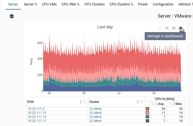
Each graph has a star on its top-right, clicking it opens a dialog for adding the graph into the dashboard.
The user can create new dashboard tabs and groups, folders, subfolders and add graphs into them.
The dashboard is fully customizable, you can:
Dashboard setup is defined per user.
(This is not available in the Summary pages)
Use the contex menu (right click) and create a new dashboard
Enter dashboard name
It appears in the menu, select it
On the right click create a group
Enter group name
Save
Result
It is up to users to select and place graphs into the dashboard.
Each graph has a star on its top-right, clicking it opens a dialog for adding the graph into the dashboard.
The user can create new dashboard tabs and groups, folders, subfolders and add graphs into them.
The dashboard is fully customizable, you can:
- Create a new tab
- Create a new group
- Move graphs between groups (drag&drop)
- Resize graphs (drag&drop)
- Resize groups (drag&drop)
- Share dashboards between users
- Share dashboards between user groups
Dashboard setup is defined per user.

|
How to create a new dashboard
Select a graph and click on the star on the top right(This is not available in the Summary pages)
|
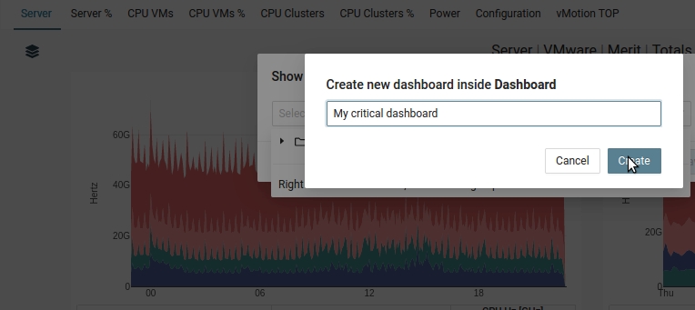
Use the contex menu (right click) and create a new dashboard

|
Enter dashboard name
|
It appears in the menu, select it

|
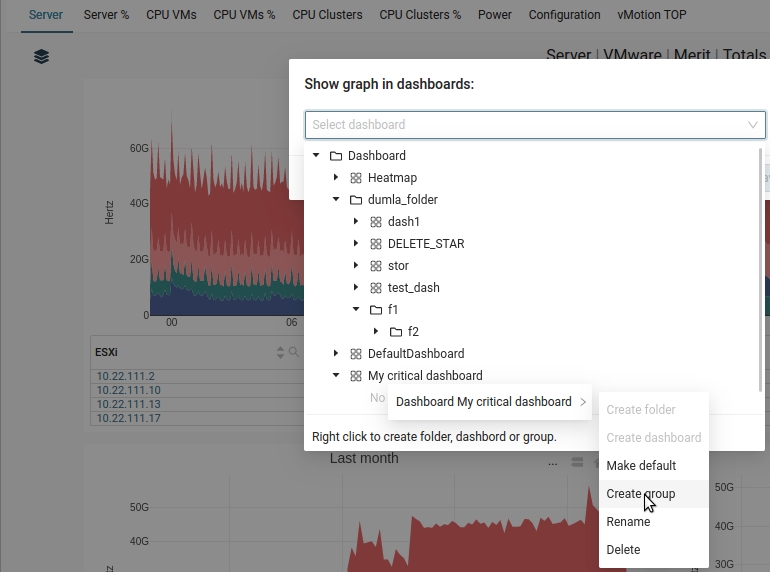
On the right click create a group
|
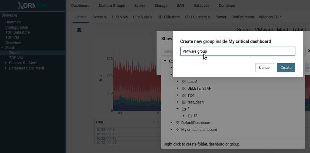
Enter group name
|
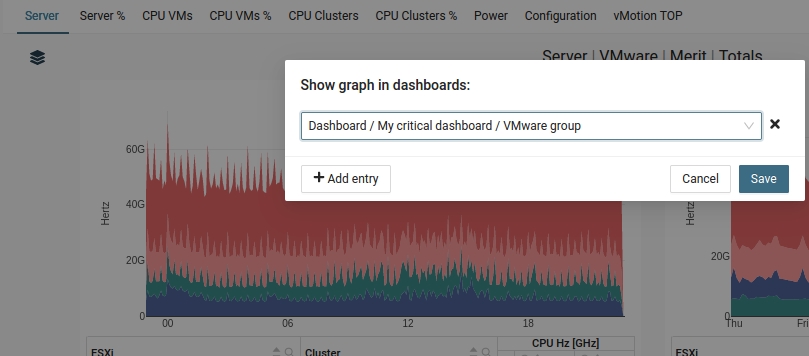
Save
|
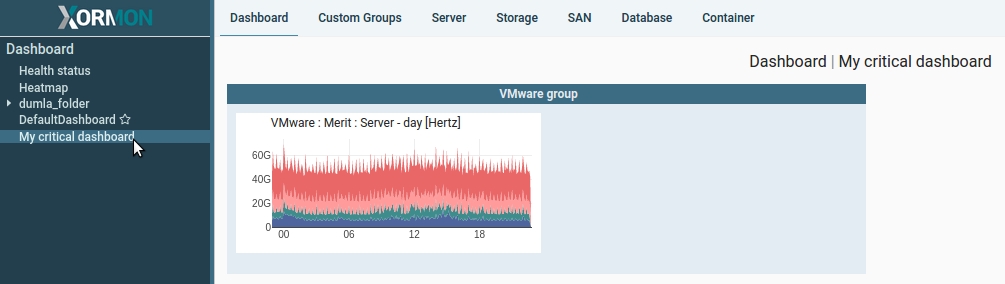
Result
|
Dashboard Templates
Dashboard Templates let you add a complete, predefined set of graphs for a monitored device to a dashboard in a single step. You don't need to pin each graph one by one; XorMon adds the most important graphs for the device at once.Adding a device to a dashboard
Every monitored device in XorMon has a Summary page. It gives an overview of the device, with its key graphs and additional information.
On the Summary page,
- Open the page of the device you want to add
- Click the dashboard template icon in the top right corner to add the device to a dashboard
A dialog opens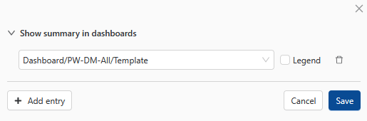
- Select the dashboard you want to add the device to
- Choose whether the graphs should be shown with or without a legend
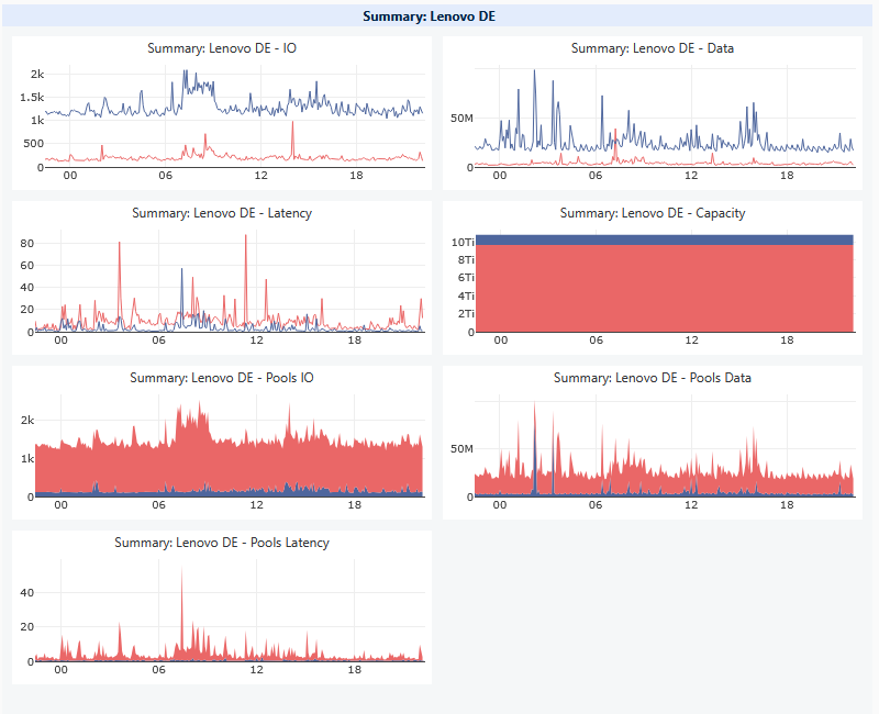
XorMon creates a new group on the selected dashboard. The group has a visible border and contains all predefined graphs for the device.
It will be named: "Summary: <device name>"
After the group is created, you can adjust it like any other dashboard content
|
Dashboard Autoplay
Available since XorMon 2.4.0Dashboard Autoplay turns a folder of dashboards into a rotating slideshow. XorMon shows each dashboard in the folder one after another, at an interval you choose. This is useful for wall-mounted screens, NOC displays, and operations rooms, where your team needs to watch the state of the whole data center (servers, storage, SAN, LAN, databases, and more) without clicking between pages.
Requirements
Autoplay is available for any dashboard folder that contains at least two dashboards. For folders with only one dashboard, the Autoplay option is disabled.
Starting Autoplay
- Open the dashboard folder you want to present
- Click Autoplay
- The Autoplay control will appear

- Click the play button
- XorMon displays the first dashboard in the folder and then switches to the next one after the set interval.
When it reaches the last dashboard, it starts again from the first.

|
- Setting the interval
You can choose how long each dashboard stays on screen before Autoplay switches to the next one.
The default interval is 30 sec. - Pause / Resume
Stop on the current dashboard to look at it more closely, then continue from the same place. - Previous / Next
Go back to the previous dashboard / skip straight to the next dashboard in the folder. - Maximize view
Dashboards in Autoplay can be maximized. In the maximized view, XorMon hides the application menus and navigation, so the dashboard content fills the whole browser window. This is the recommended mode for large monitors and TV screens.